New Scalable Logo & Website
Exploration of branding and identity concepts for a potential side venture in another industry.
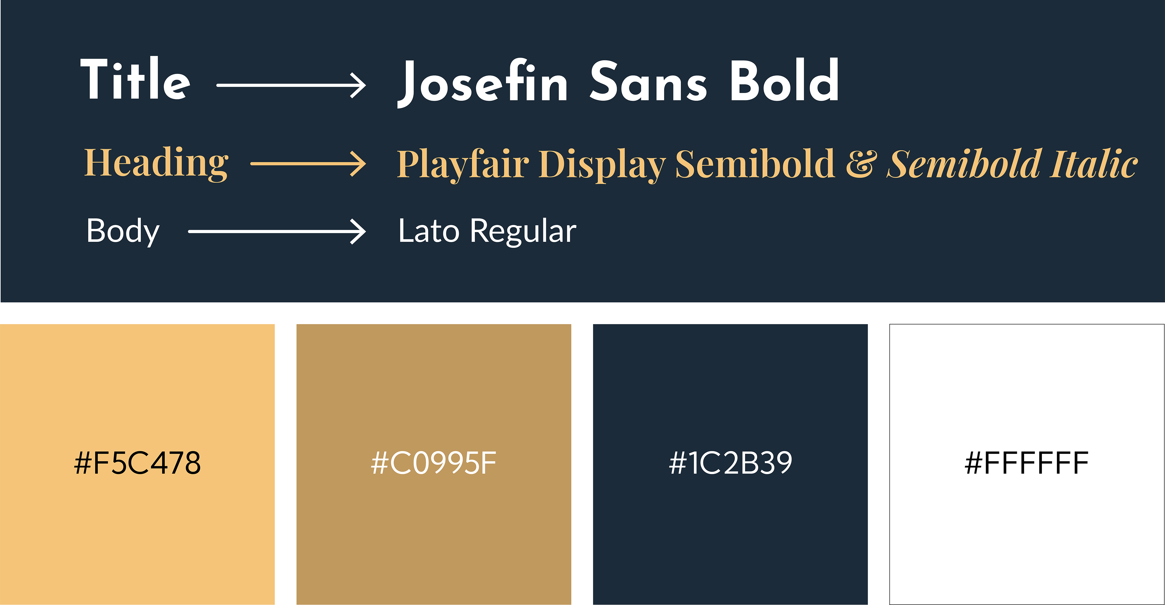
My Role:
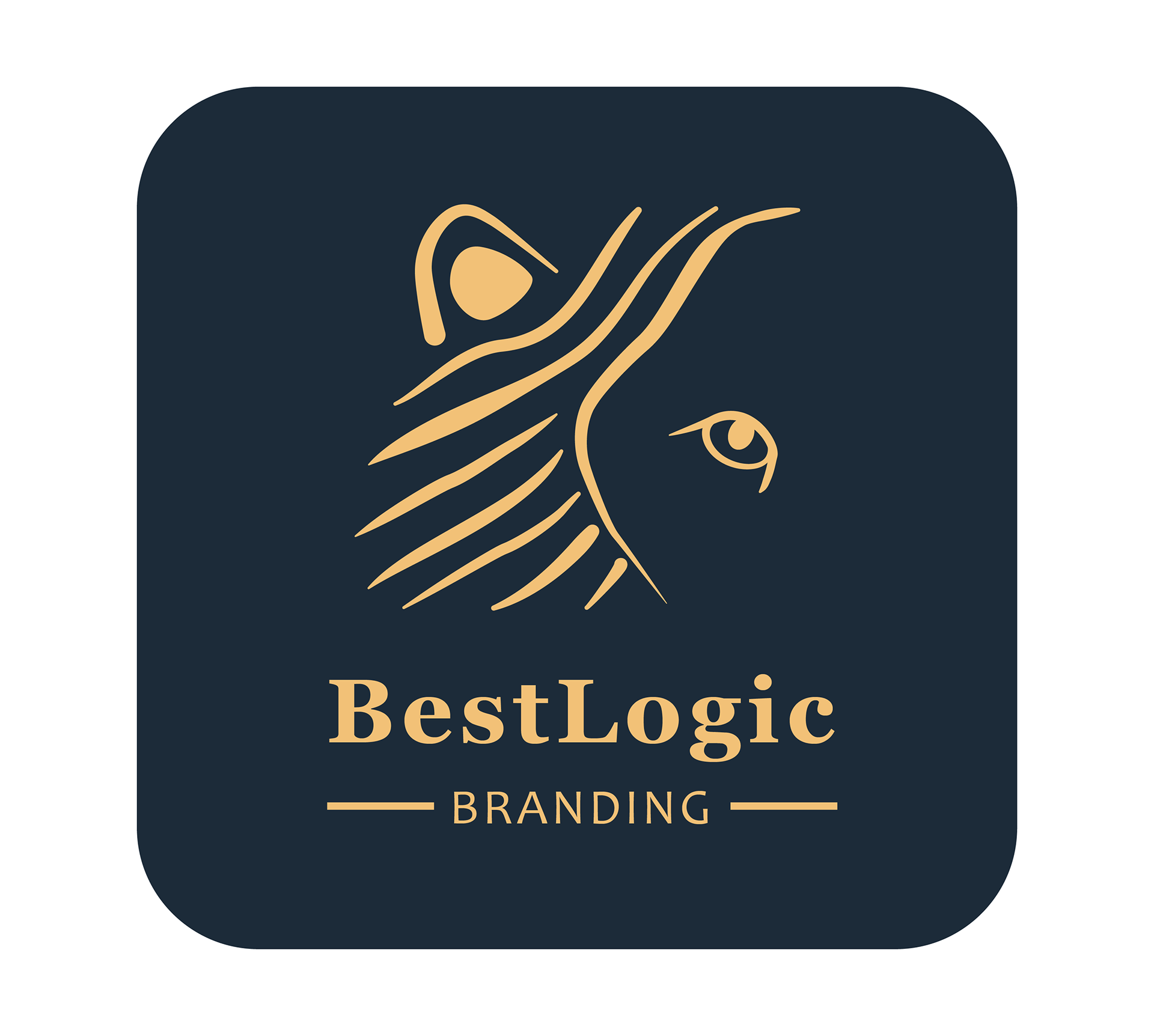
• Logo exploration (“I Hear You, I See You”)
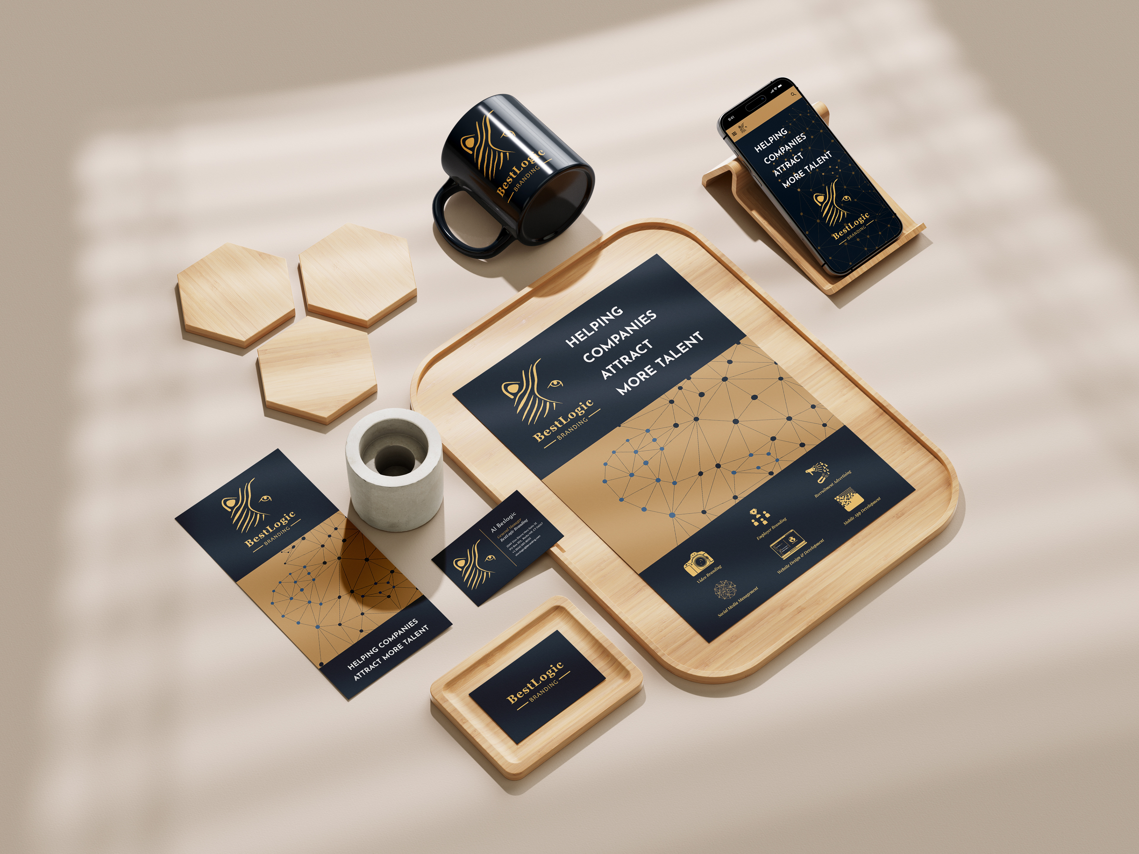
• Secondary website mockup and identity system
• Applications across stationery, apparel, and signage

T-Shirt

Baseball Cap
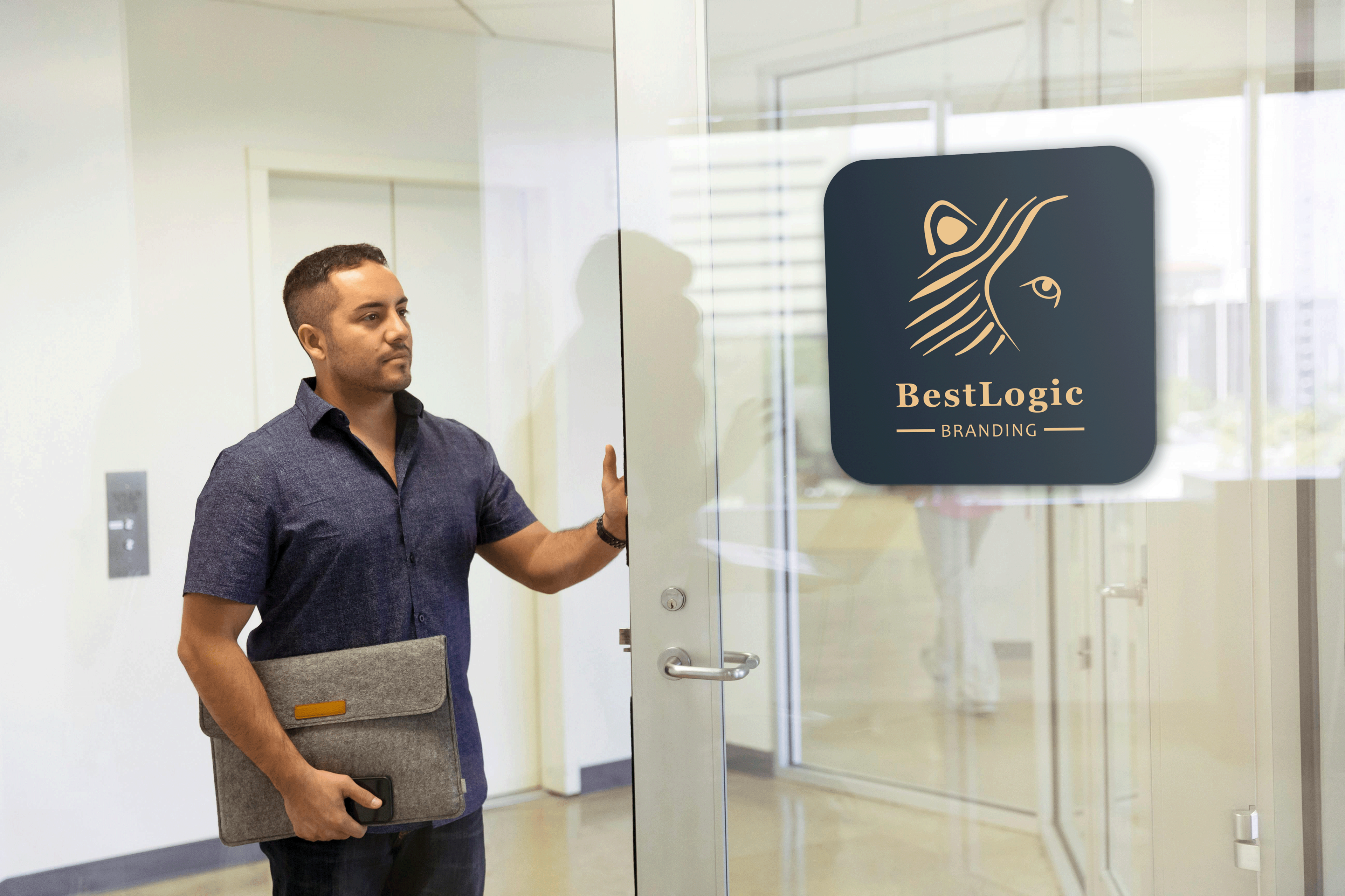
Yellow & navy vinyl door decal, adhered to front of glass door
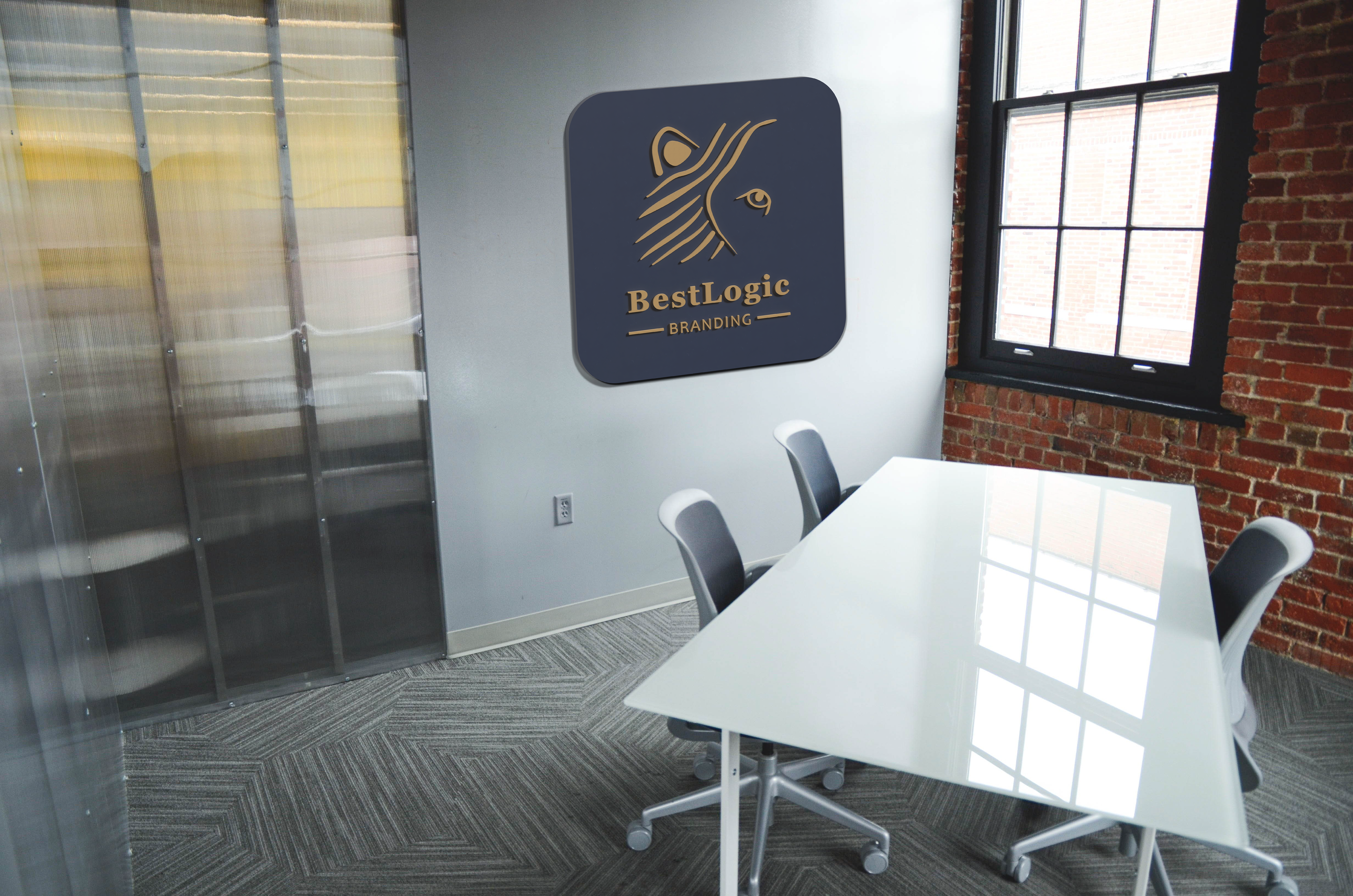
Yellow dimensional letters on a wall mounted navy backer.
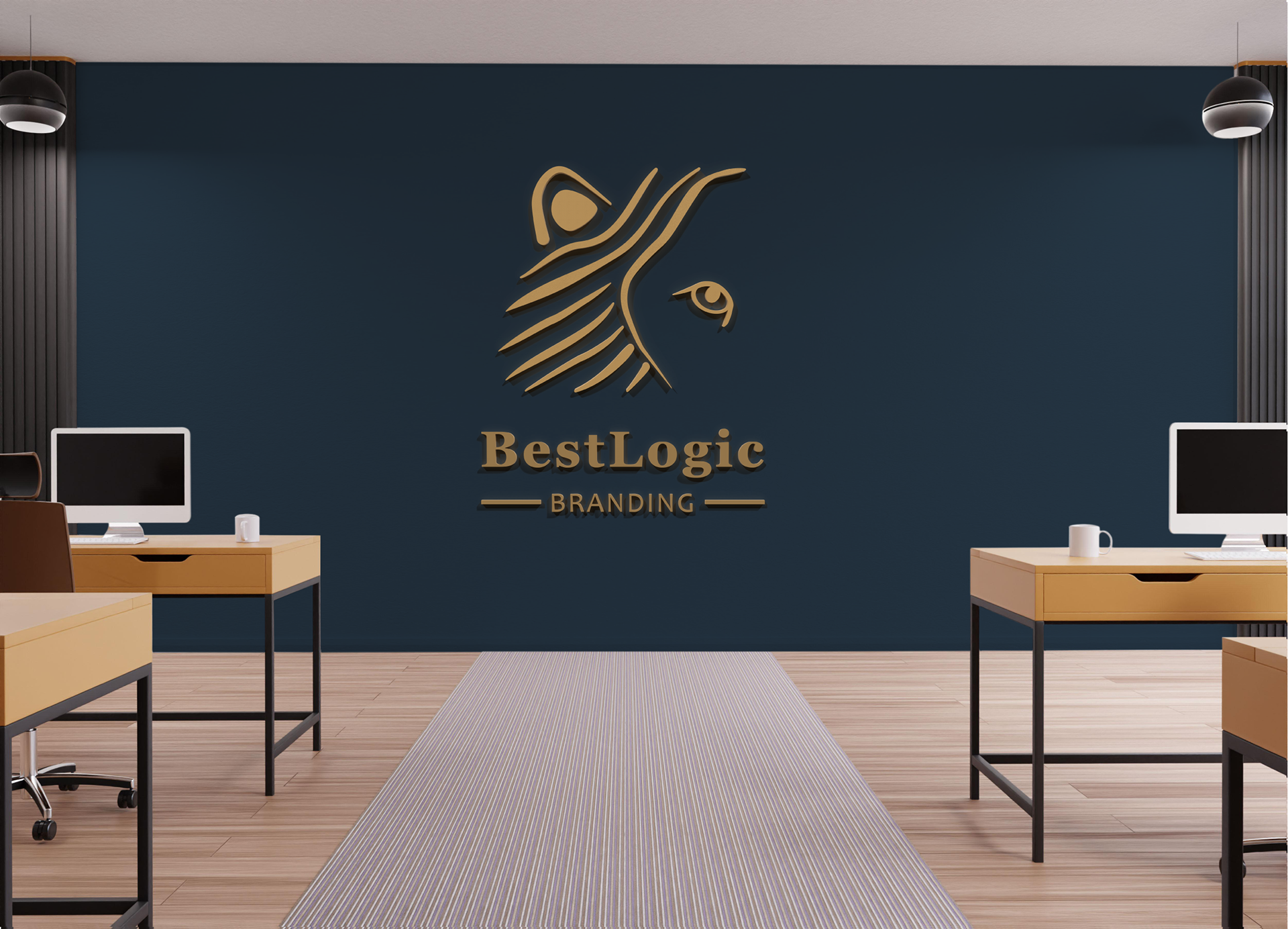
Yellow dimensional letters directly mounted to a wall painted navy.
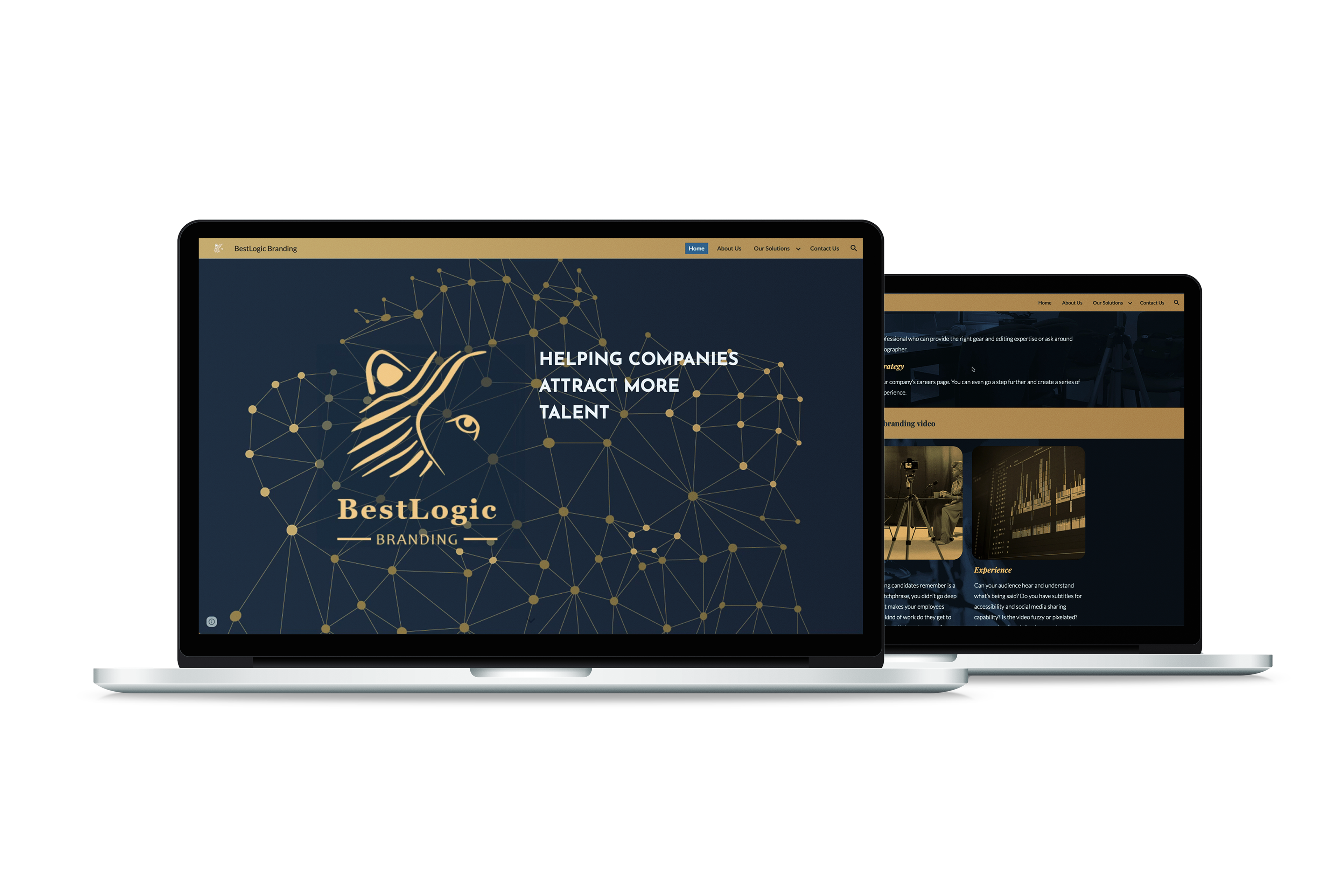
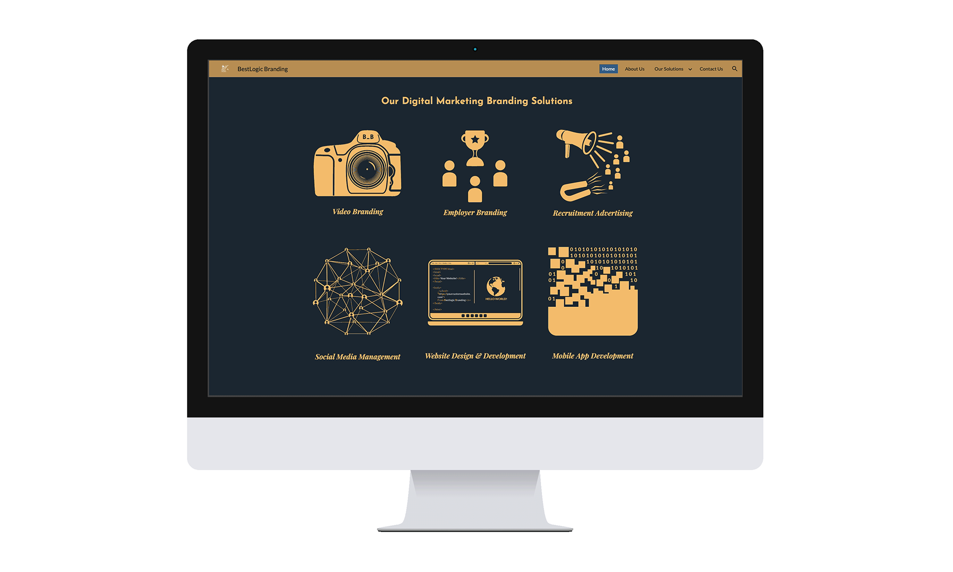
Image by CosmoStudio on Freepik
Approach / Process:
• Researched symbolic forms (lion’s eyes/ears) tied to listening and visibility themes
• Built logo vectors from sketches, tested across multiple applications
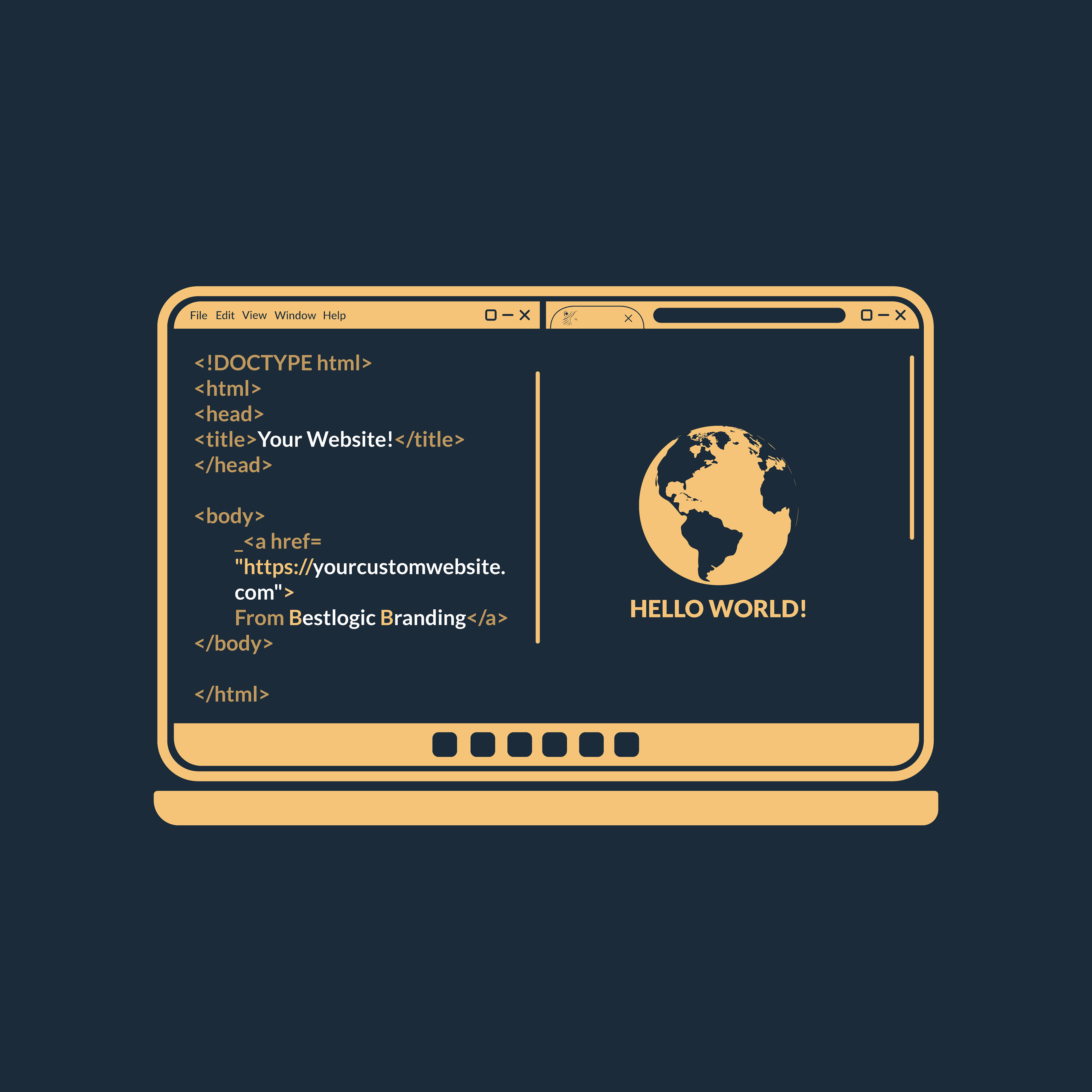
• Developed secondary website prototype to show brand in digital space

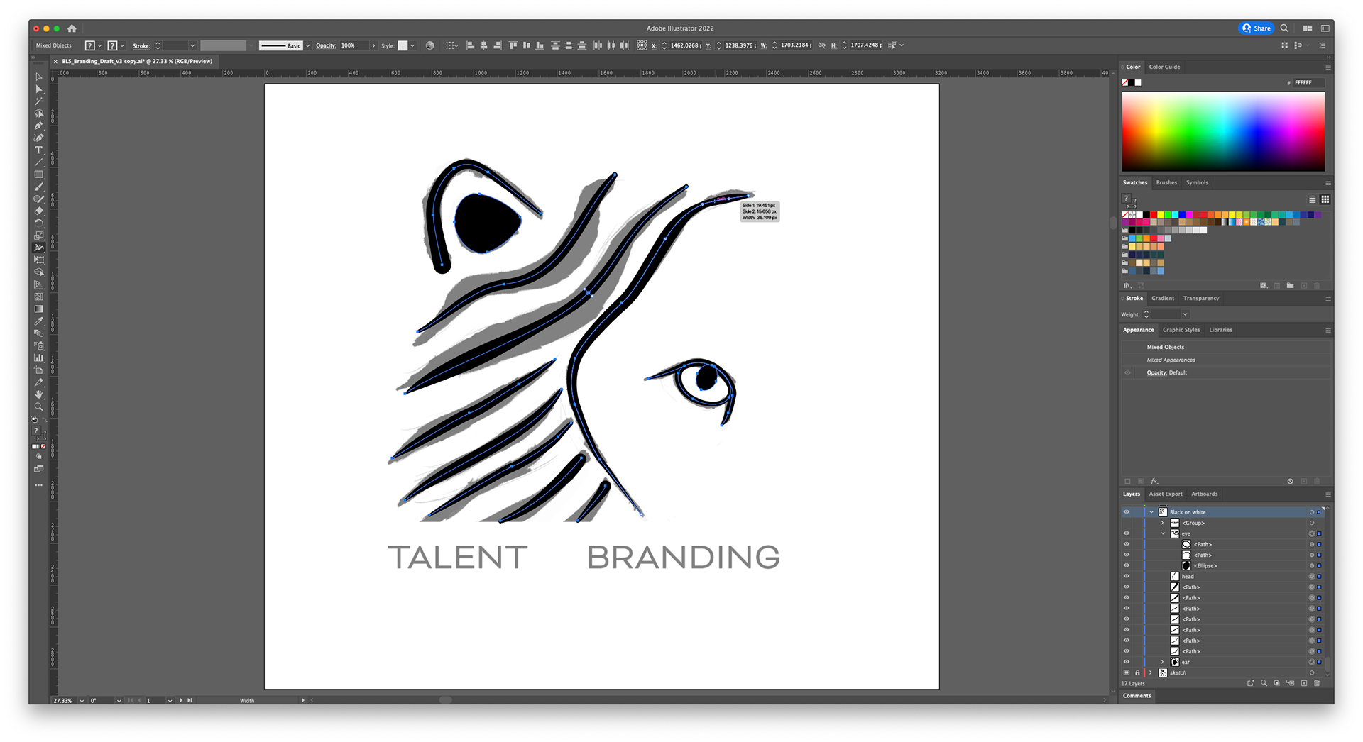
Very simple first sketch.
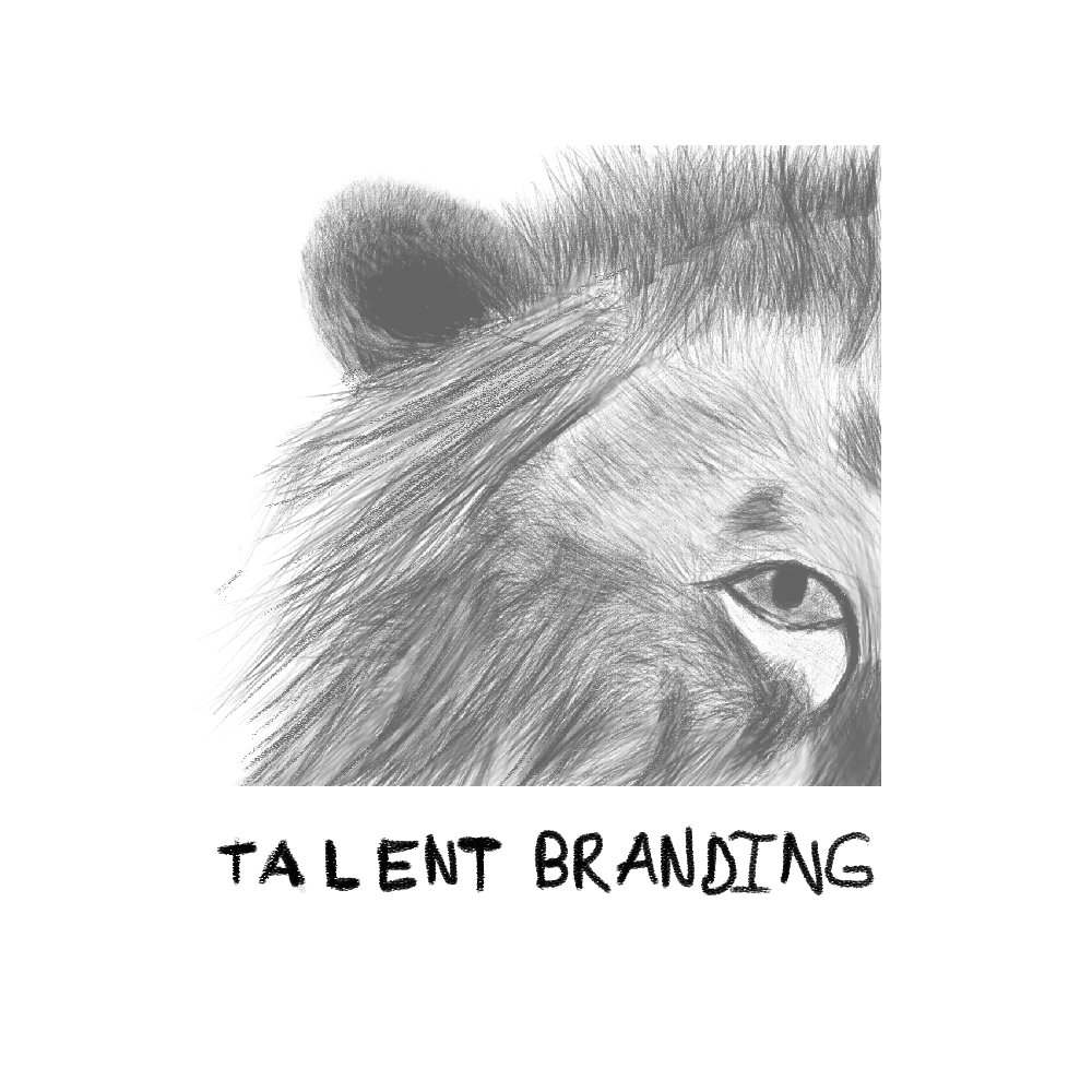
Hyper detailed second sketch.
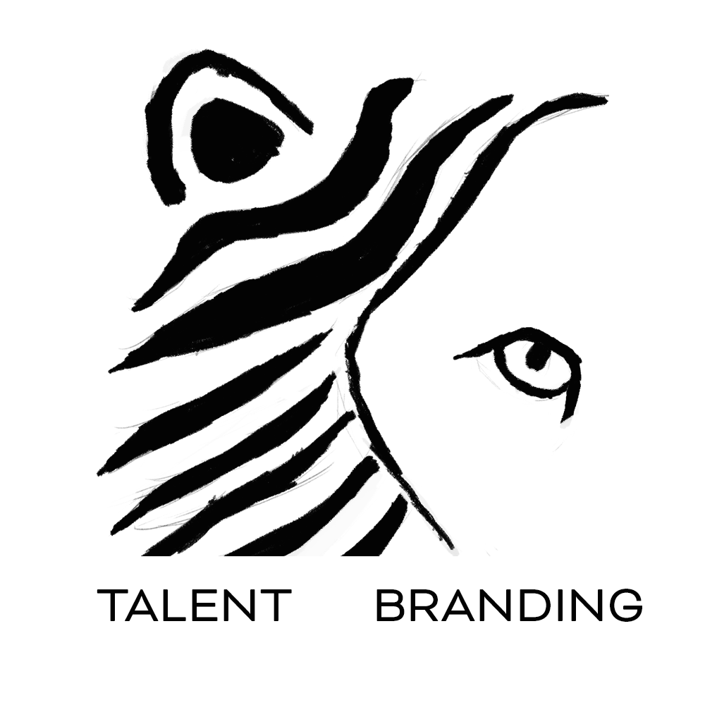
Third and final sketch approved for logo.

Video Branding

Employer Branding

Recruitment Advertising

Social Media Mangement
Website Design & Development
Mobile App Development
Logo Design
The Impact:
• Produced flexible branding system with real-world applications
• Demonstrated adaptability in conceptual and experimental design
Reflection: This project highlighted the importance of conceptual storytelling in brand identity and applying visuals across different media.